Dashboards
Sales - via Power BI, SQL Server
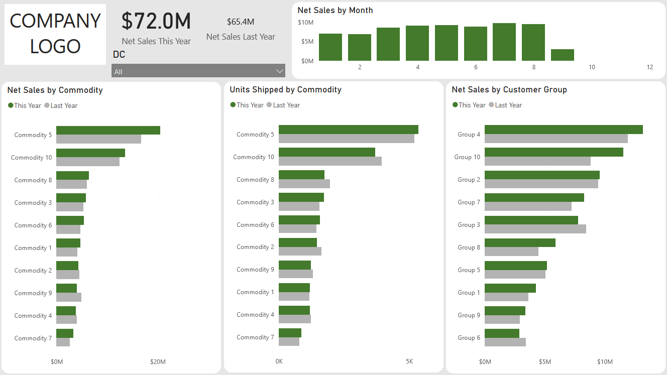
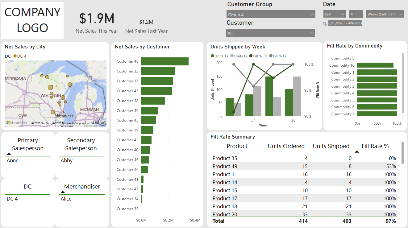
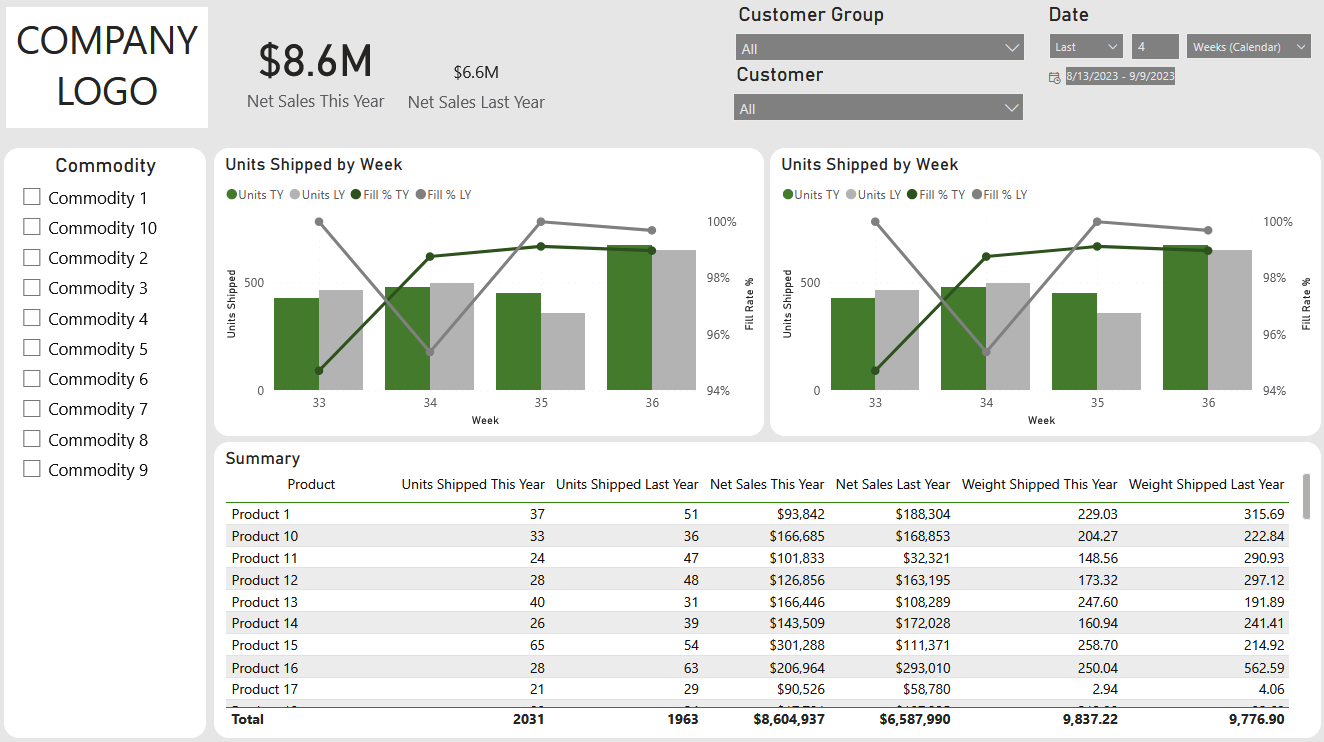
A Power BI dashboard for all levels of the sales team to track thousands of daily transactions,
monitor trends, analyze movement patterns, and assess customer behavior.
I utilized the company's newly implemented SQL Server to query data from their ERP, integrated external sources, and
brought in budgeted goals to centralize data and bring uniformity across the company. I interacted with varying levels of
sales team members to address their specific requirements and preferences.


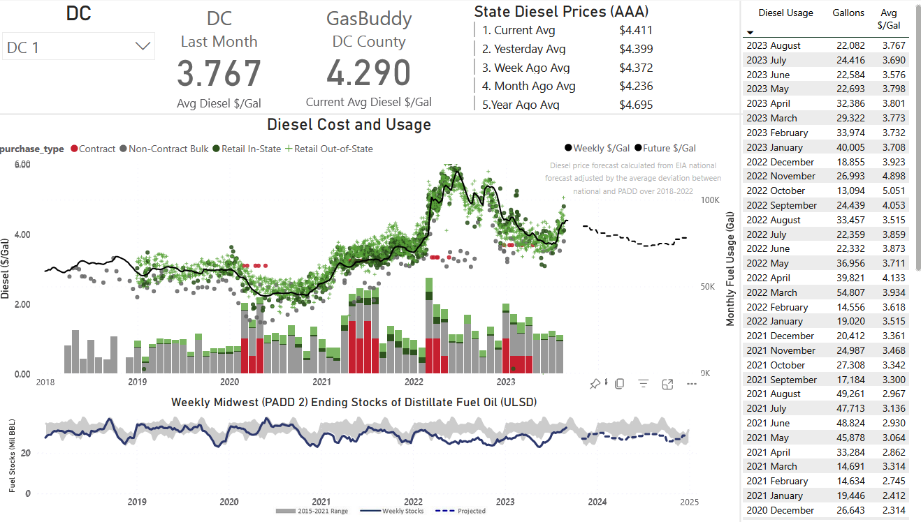
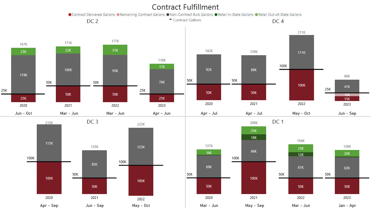
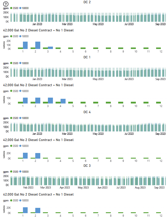
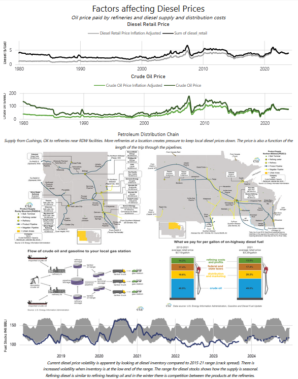
Fuel - via Power BI, MS Access, Python (Selenium)
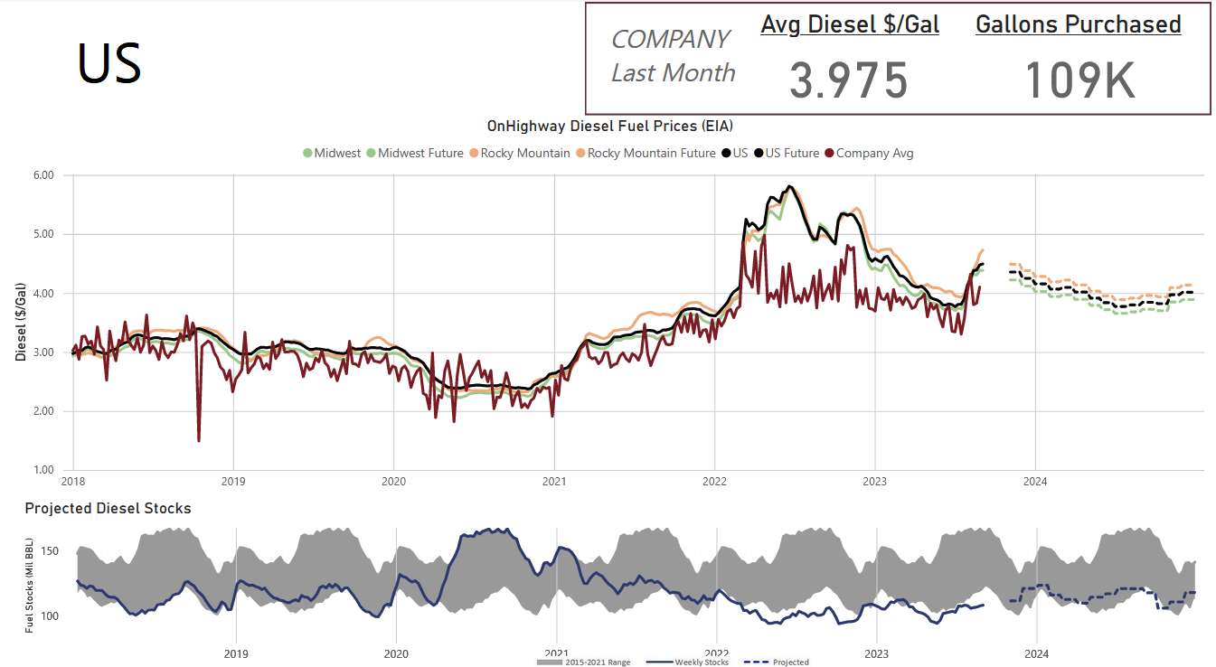
A PowerBI dashboard tracking diesel purchases across distribution centers enabling recommendations
for fuel contracts using historical data and cost-efficiency analysis.
I managed an MS Access database by consolidating daily invoices from various sources, integrating
Environmental Impact Assessment (EIA) website data,
and contracting information. I also also connected to the AAA
website through Power BI for state data and web scraped with Python (Selenium) to tie in
local fuel prices reported by GasBuddy.
Vizualizations
Minnesota Early/Absentee Voting
Hosted on Tableau Public - via Tableau, Excel
A look into the increased popularity of early and absentee voting for presidential elections in Minnesota,
especially as it pertained to the 2020 election. Marked by the COVID-19 pandemic, in-person voting was
advised against and the option of voting absentee was greatly encouraged. These visualizations include
a look over the past 2 decades of elections, a breakdown by county for the 2016 and 2020 elections, and
an infographic showing some demographics of early voting.
World Bank Indicators and Covid
Hosted on Tableau Public - via Tableau, Python, Excel
I set out to discover potential relationships between World Bank Development Indicators and COVID-19 cases by country. I pulled data from multiple sources,
with most data management carried out using Python. In Tableau, I created graphs for each indicator (such as life expectancy, tobacco use, etc.) with the
countries COVID-19 case rates, as well as an interactive version with which the dates of interest can be manipulated and more.